Posted on

Musculoskeletal Specialty Group – Update in the Management of Knee Osteoarthritis cum BGM

10 Jan 2023 (Tue)

6:25pm - 6:30pm (BGM)
6:30pm - 7:30pm

Posted on

Haemophilia Joint Health Webinar

18 Nov 2022 (Fri)

19:00 - 20:10 (HKT)

Posted on

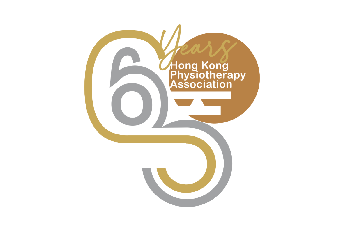
HKPA Logo Competition (60th Anniversary) Voting (members only)

HKPA is celebrating our 60th Anniversary in the coming year (2023). 
Previously we have held a Logo Competition (Theme and objectives: 60th Anniversary of Hong Kong Physiotherapy Association). 
After receiving a number of designs, which have been assessed by HKPA executive committees, we would like to invite our HKPA members to vote for the best design among the following three designs. Please also refer to the HKPA website for detailed description for each design. 

Deadline: Nov 14, 2022 (Monday)

Design 1

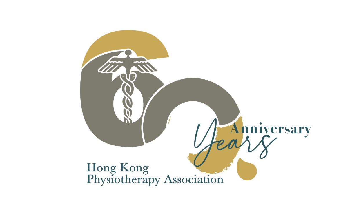
The logo comprises of routes and lines which represent the development of HKPA & physiotherapy in Hong Kong, core values were inherited along the years with emerging advancement. Typography “60” is more obvious to be observed from the logo, where when it is viewed in different perspective, “H” “K” “P” “N’ are embeded. Classy silver, gold and bronze colours are used in a contemporary twist to synonym the properties of metals, all being malleable and ductile. HKPA connects the industries in different specialties and work places, which show the extensiveness and flexibility of the professional.

Design 2

Neat and simplified artistic variation of the typography, “60”, partly embeded with the original logo of HKPA shows a smooth compatibility of the passing on values and the emerging ideas of the new generations. The going on and interconnected flow of the logo emphasises the importance of unityof the association. The brush stroke in the logo indicates the art of physiotherapy and possibility to further elaborate in the future.

Design 3

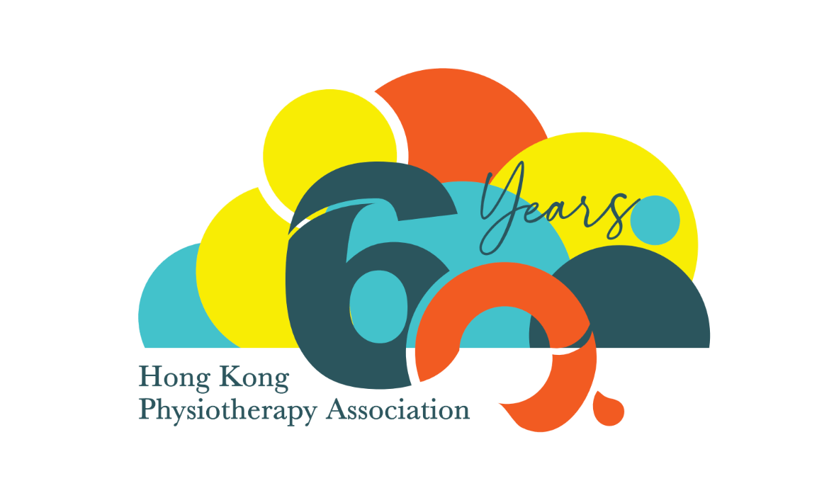
The circles represent the interconnection of physiotherapists from different sectors, and provide services to people in the community in Hong Kong. Contrasting and cheerful colours indicate the youthfulness and energetic sensibility of the association. The words “P” “a’ are embeded in the logo in an artistic sense.
Posted on

HKPA M&A Review Member Consultation 

Posted on

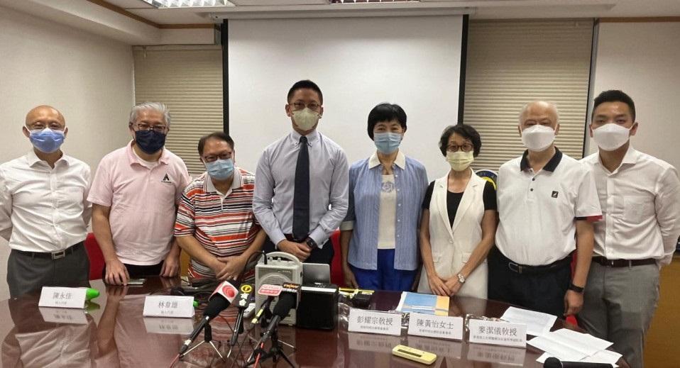
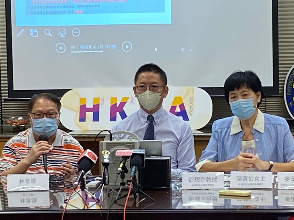
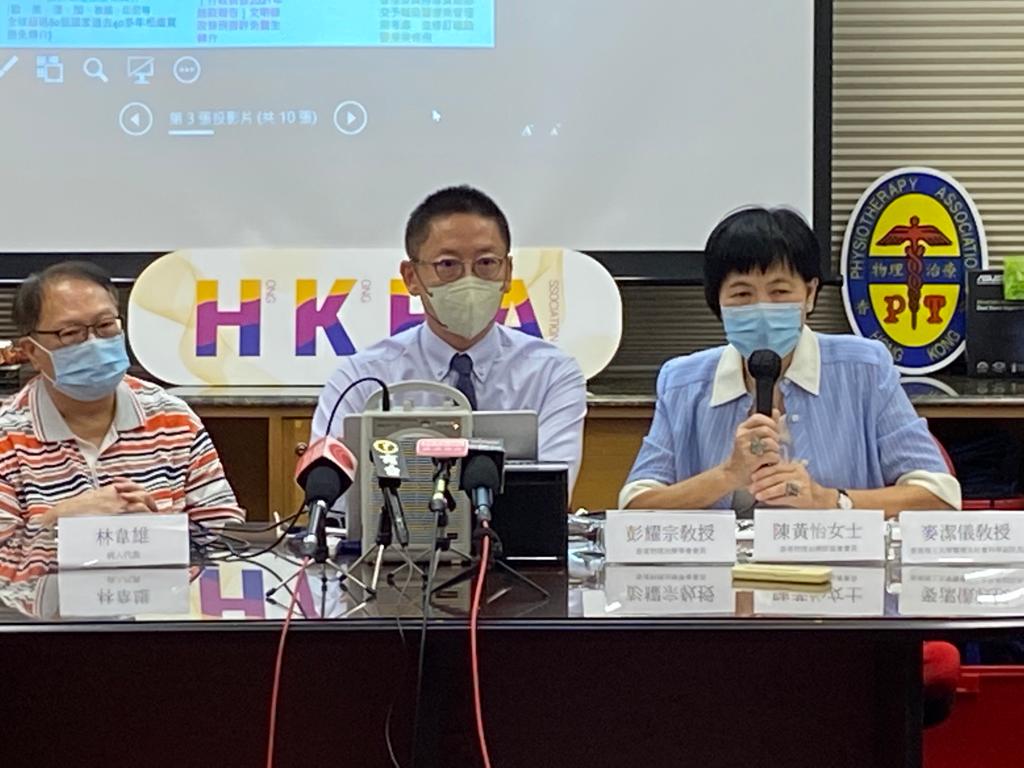
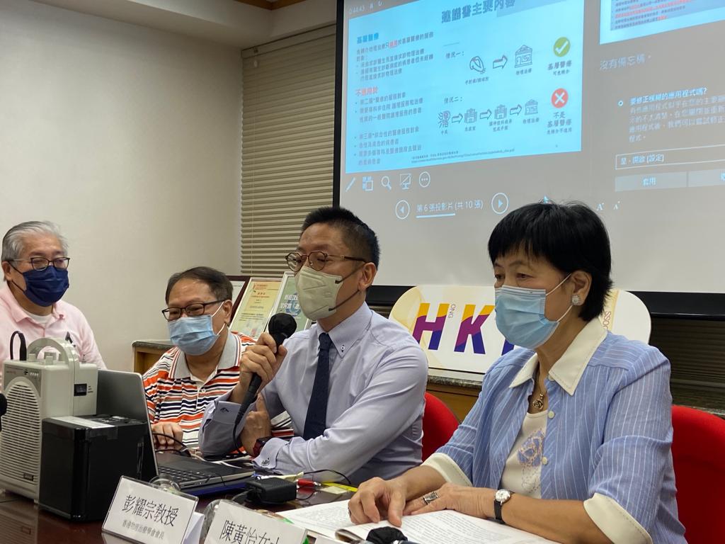
Direct Access Press Conference on 21 Sep 2022

前特首林鄭月娥於[行政長官 2021 年施政報告]明文修改法例容許免醫生轉介而讓市民選擇直接接受物理治療服務,避免延誤治療,藉以強化基層醫療體系。物理治療師管理委員會轄下實施物理治療服務更新轉介系統 工作小組(下稱工作小組)當中有物理治療師、醫生及病人組織等界別的代表,經過多方面檢討現時轉介病人的規限,平衡各方意見後,已完成相關建議書並已提交至物理治療師管理委員會 。該工作小組早於 2009 年已成立研究如何落實免轉介制度,至今已超過 13 年,但因醫生阻力一直未有進展。由 1976 年開始,全球第一個免轉介國家澳洲,直至現在全球已超過 80 個國家,包括英、美、加及鄰國泰國、印尼等地已容許免轉介……
Posted on

Workshop on Patients with Depression or Anxiety in COVID Pandemic Medical Management, Mental Health Support and Physiotherapy Management in Mental Rehabilitation