

[woocommerce_messages]
Day: October 10, 2022
HKPA Logo Competition (60th Anniversary) Voting (members only)
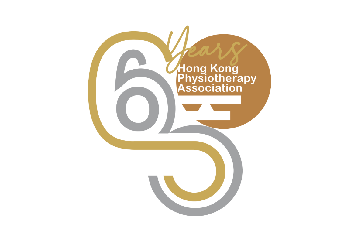
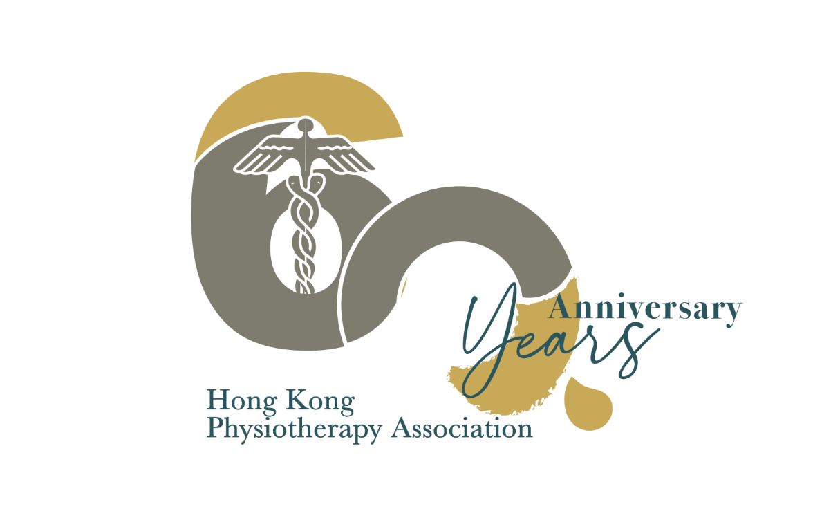
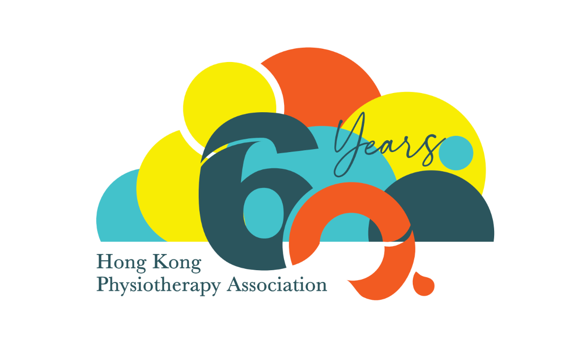
HKPA is celebrating our 60th Anniversary in the coming year (2023).
Previously we have held a Logo Competition (Theme and objectives: 60th Anniversary of Hong Kong Physiotherapy Association).
After receiving a number of designs, which have been assessed by HKPA executive committees, we would like to invite our HKPA members to vote for the best design among the following three designs. Please also refer to the HKPA website for detailed description for each design.
Deadline: Nov 14, 2022 (Monday)
The logo comprises of routes and lines which represent the development of HKPA & physiotherapy in Hong Kong, core values were inherited along the years with emerging advancement. Typography “60” is more obvious to be observed from the logo, where when it is viewed in different perspective, “H” “K” “P” “N’ are embeded. Classy silver, gold and bronze colours are used in a contemporary twist to synonym the properties of metals, all being malleable and ductile. HKPA connects the industries in different specialties and work places, which show the extensiveness and flexibility of the professional.
Disclaimer and Important Notes
By accessing the Hong Kong Physiotherapy Association (HKPA) website and any of its pages, you are agreeing to the terms set out below, and continuing to use this website following the posting of any changes to these terms will signify your consent to the changes made.
Disclaimer
The information contained in this website is compiled by HKPA for general information only. Whilst HKPA endeavours to ensure the accuracy of this general information, no statement, representation, warranty or guarantee, expressed or implied, is given as to its accuracy or appropriateness for use in any particular circumstances.
This website may also contain information contributed by others over whom, and in respect of which, HKPA may have no influence. Users may link from this website to sites provided by others. HKPA expressly states that it has not approved or endorsed the information provided by others on this website or any other sites linked to this website, and HKPA accepts no responsibility or liability (howsoever caused) for such information.
HKPA is not responsible for any loss or damage whatsoever arising out of or in connection with any information including data or programmes on this website. HKPA reserves the right to omit, suspend or edit all information compiled by HKPA on this website at any time in its absolute discretion without giving any reason or prior notice. Users are responsible for making their own assessment of all information contained in this website and are advised to verify such information by making reference, for example, to original publications and obtaining independent advice before acting upon it.
Copyright Notices
The content available on this website, including but not limited to all text, graphics, drawings, diagrams, photographs and compilation of data or other materials, is subject to copyright owned by HKPA or other entities. Except as expressly permitted herein or where prior written authorization is obtained from HKPA, any reproduction, adaptation, distribution, dissemination or making available of such copyright works to the public is strictly prohibited.
Personal Information Collection Statement
HKPA will collect information when you register with this website, use our on-line services, or communicate with us. In the process, you may be required to provide your personal information including, but not limited to, your name, your company / organization name, telephone number, fax number, address, email address, occupation, academic qualification, etc. If specific information is requested but not supplied, this website may be unable to provide the requested service. The purposes of information collection will be used by this website including, but not limited to verify the qualification of the registration for the HKPA membership.
HKPA will record visits to this website without collecting any personal identifiable information of users. Such general statistics are collected for the compilation of statistical reports and the diagnosis of problems with or concerning computer systems to help HKPA improve this website.
This website uses SSL protocol to encrypt data during network transmission to protect your personal data during registration, login and changing password. All personal data you provide to HKPA via this website are secured, and access to them is restricted to authorized personnel only.
Privacy Policy Statement
When you browse our website, cookies may be temporarily stored in your computer’s hard drive, and will be removed after you close your browser. The purpose of using cookies is for internal navigation only. We will not collect any personal data from you under this circumstance. You can choose not to accept the cookies by configuring your Internet browser settings, but if you do, you may not be able to acquire full functionality of our website.
Accessibility Statement
This website adopts web accessibility design and conforms to the World Wide Web Consortium (W3C) Web Content Accessibility Guidelines (WCAG) 2.0 Level AA standard. Should you have any enquiries or comments on its accessibility, please contact us by phone or email.

[user_membership_plan]
Print time: [current_datetime]